Shropshire, UK

Background:
Every year, over half a million women across the globe will develop cervical cancer and more than 300,000 die from the disease.
The great tragedy about these shocking statistics is that these deaths can be prevented through early screening and timely vaccination. In fact, it’s possible to virtually eliminate this type of cancer with the existing vaccines we have available. That’s because cervical cancer is caused by a virus and can therefore be treated by early vaccination.
This is a huge opportunity to save hundreds of thousands of women every year.
Many countries have adopted a robust rollout of the HPV vaccine over the last decade, but many others still lag far behind putting many women at risk.
As part of #MakeoverMonday, within the Tableau Community, we were asked to interpret and visualise vaccine data from Our World in Data. This dataset included worldwide vaccine data from 2010-2022 and vaccine data was included for individual countries and regions/continents.
Prepare:
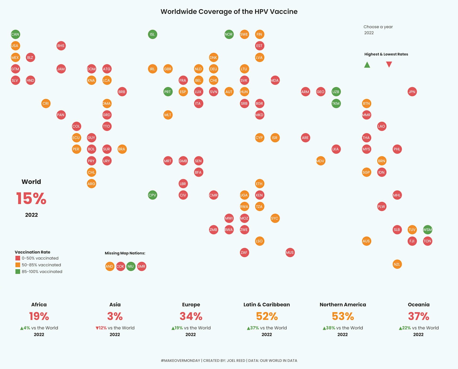
For this visualisation, I wanted to showcase the vaccine adoption rates through a map of the world.
To achieve this, I decided to use a tile map chart, having being inspired by JiaYan Ng.
Unlike traditional geo maps of the world, a tile map in Tableau is a map that shows each region as the same size and shape. This is useful for visualising and comparing regions that are different sizes, such as the 50 states in the United States.
The problem?
I’d never built a tile map before.
So, I started to do some research and came across a brilliant blog post by Lex Devlin from The Data School. The blog provided tips on how to assemble a tile map chart in Tableau and also linked through to the Tile Map dataset by Mustafa Saifee. A huge thanks to Mustafa for his work.
The Tile Map dataset from Mustafa was in JSON format, so I converted the files over into CSV (comma-separated values) format using the tool suggested by Lex. This would allow me to work with the Tile Map data in Tableau.
Within Tableau, I was then able to join my Tile Map dataset to the HPV vaccine data, joining on the common Alpha-3 field, e.g. ALB for Albania, which was identical across both datasets.

Visualisation:
With my data cleaned and joined, it was now time to assemble my dashboard.
Following Lex’s clear instructions, I was able to create my tiled map of the world. I decided to use circles for my tiles, rather than squares, to represent each nation within the HPV dataset.

I then created a Calculated Field to create three percentile groups for vaccination (0-50%, 50-85%, and 85-100% vaccinated). I then applied this Calculated Field to my color mark to create a RAG status for each country, with red highlighting the countries with the lowest vaccination rates and green the highest.

A filter was included to allow users to toggle between 2010-2022 and see the annual changes in vaccine take-up over time.
To support this insight further, I also created a line graph that showed an individual country’s vaccine take-up over the previous 12 years. This was then embedded in the tooltip for my tile circles, so, for example, if a user hovered over Portugal, they would then get a full historical breakdown of HPV rates for that country. I included a RAG background in this line chart to visualise when (or if) a country moved between percentile bands over time.

I also created a further two charts which ranked the Top Ten ‘Best’ and ‘Worst’ performing countries for vaccine adoption (based on the year filtered). These charts were also embedded into tooltips and accessed via my triangular shape indicators. The ranking was achieved through a Calculated Field using the in-built RANK function.

The visualisation was completed by introducing a series of headline vaccination numbers for the various continents and regions throughout the world. By creating further Calculated Fields, I was then able to show how these regions compared to the worldwide vaccination rate as a percentage.
One issue I found with the Tile Map dataset was that four countries from the HPV dataset were missing and so these weren’t mapped and represented by a circle like the other countries. So, I created a further four circles in a separate chart covering the data for Andorra, Cook Islands, Niue, and San Marino. It was important to include every country, especially as Niue had the highest vaccine rate globally in 2022 with 100% of young girls vaccinated.
Findings:
The data showed that the worldwide adoption rate of the HPV vaccine had grown from 3% in 2010, to 15% in 2022. An increase of 12% in 12 years.
Northern America had the highest vaccine adoption rate in 2022, with 53% of 15 year old females fully vaccinated. This was 38% higher than the worldwide rate of 15%.
Asia had by far the lowest rates of vaccination in 2022, with just 3% of young girls vaccinated against HPV. This was 12% down on the worldwide rate of 15%.
In my own country – the United Kingdom – our rates have dropped from 81% in 2019 (the top percentage band), down to 56% in 2022. That represents a drop of 25% in four years, although the COVID pandemic is likely to have impacted people’s medical appointments and their access to the HPV vaccine.
The Dashboard:
My final dashboard can be accessed here.

Written by Joel Reed. Read more of my blogs.