Shropshire, UK
Background:
How happy is your country?
This was the key question at the heart of a dataset provided by the World Happiness Report (WHR) for #MakeoverMonday within the Tableau Community.
The WHR calculates a country’s happiness levels by measuring different criteria, such as:
-
- Freedom to Make Life Choices (Personal autonomy)
- Generosity (Charitable acts and societal support)
- Life Expectancy (Healthy life)
- Log GDP per Capita (Economic strength and stability)
- Perception of Corruption (Trust in authority, such as the government)
- Social Support (Support from the government and the rest of society)
Countries were ranked according to their self-assessed life evaluations (answers to the Cantril ladder question in the Gallup World Poll), averaged over the years 2021-2023.
For each metric, the country was assigned a score, and the accumulative overall score was used to rank the countries.
We were asked to visualise the 143 countries from around the world who took part in the survey and highlight which countries were the ‘happiest’ on the planet.
Prepare
I downloaded the dataset from Data World and there was little to no data cleaning required before my dashboard could be built.

Once I had imported my data into Tableau, the next thing I did was to create a Pivot Table, grouping the various happiness criteria with the corresponding scores for each individual country, bringing 14 separate columns (seven criteria and seven scores) down into two columns. This would make grouping and ranking the nations much easier later down the line.

Visualisation:
With my data imported and pivoted, it was now time to assemble my dashboard.
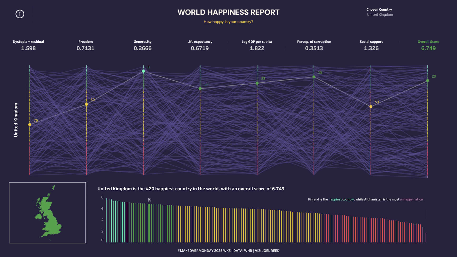
For this dashboard, I wanted the user to be able to select an individual country and see the various rankings for each of the several happiness criteria, plus the overall happiness score. I also wanted the user to see how the selected country compared to the rest of the world.
To visualise this, I decided to create a Bump Chart. Bump charts are designed for exploring changes in rank over time. I was inspired in my approach after seeing some previous ranking charts by the very talented Tamás Varga.

I created a Calculated Field called [Country Rank Pivot] to RANK my Pivot Values: RANK(AVG([Pivot Field Values]), 'DESC').
I then added my [Country Rank Pivot] field twice into my Columns, before converting the fields on to a Dual Axis. I selected circle for one chart and line for the other. I then filtered on the selected country via a parameter called Chosen Country.
I wanted my bump chart to be colourful and so I created another Calculated Field to group the countries based on their ranking, with the unhappiest countries denoted in red, satisfied countries in amber, and the happiest countries in green. A further Calculated Field allowed me to size the circles based on whether they were the Chosen Country or not.
I introduced a series of Worksheet Actions which would update all the elements of my dashboard when a user selected a new Chosen Country via the filter drop down, or clicked on other elements such as circles or bars.

After completing my Bump Chart, I then prepared a simple bar chart graph that contained all 143 countries and ranked them from happiest through to most unhappy. Through my Worksheet Actions, users can click a country’s bar and the entire dashboard will update to reflect the new country’s details.

I rounded off my chart by creating some Happiness KPI headline stats which could appear above my bump chart. I also created a simple Map Layer chart which would represent the selected country.
Then it was a case of bringing it all together!
Findings:
Finland was ranked the happiest nation on earth in 2024.
The Scandinavian countries dominated the happiness rankings with Denmark in 2nd place and Sweden in 4th. Norway was 7th.
European countries also monopolised the Top 10, with 8 countries from Europe making up the Top Ten. Israel and Australia were the only non-European countries in the Top 10.
The USA was ranked #23 in the world, while the UK managed to rank slightly higher in 20th position.
The most unhappy nation on earth by some distance was Afghanistan, which came out bottom in 143rd place. Lebanon also scored below 3 on their happiness scale placing them in 142nd place,
The Dashboard:
My final dashboard can be accessed here.


Written by Joel Reed. Read more of my blogs.