Shropshire, UK
Background:
In May 2025, I attended a free online masterclass with Tableau Hall of Famer Andy Kriebel, Next-Level Tableau, and over 300 people tuned in!
Andy demonstrated how to use Map Layers to build more sophisticated Tableau dashboards. Traditionally, in Tableau, you are limited to just a few fields in a single chart – but not anymore.
Map Layers open the door to exciting new possibilities, allowing you to overlay multiple data layers in one view. Tableau Visionary, Sam Parsons, has produced an amazing introduction to Map Layers which you can find here.
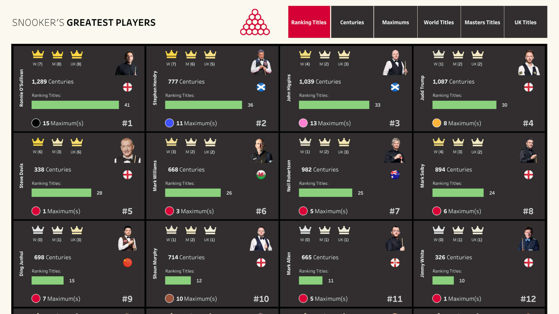
Right after the session concluded, I applied what I had learned to a dashboard I’ve been brainstorming for a long time. I had long wanted to create a complex dashboard on Snooker’s Greatest Players, but I wanted to include tons of detail as a snapshot, and couldn’t figure out the way forward.
Map Layers were exactly what I needed to bring this viz to life.
To achieve what you can see in the screenshot, you would normally need dozens of individual charts, layered up, and lots of time-consuming workarounds.
Map Layers were the key to unlocking Tableau’s full potential.
Dashboard
My final dashboard can be accessed here.

Written by Joel Reed. Read more of my blogs.