Shropshire, UK
Background:
I recently got to do some magical stuff with Tableau! 🧙
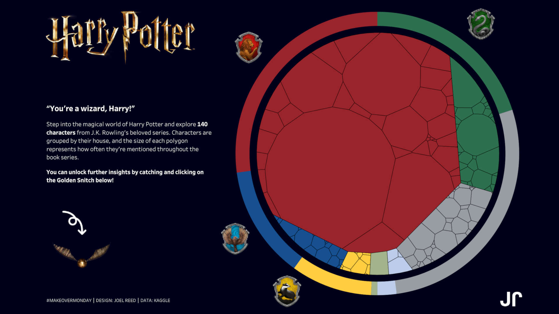
I stepped into the world of Harry Potter for this week’s #MakeoverMonday challenge!
I had an amazing time visualising 140 characters from J.K. Rowling’s beloved series.
With such a large number of characters to show at a glance, I needed the right solution.
So, I challenged myself to develop my first-ever Voronoi chart.
A Voronoi chart splits space into regions based on how close each point is to a specific thing. Just like each character claiming their own little piece of territory.
Characters were grouped into their houses and colour-coded. The size of each polygon reflects how often a character is mentioned in the books (although this isn’t exact).
I took big inspiration from Anna Clara Gatti, who designed a stunning Voronoi chart for Steam Games in early 2025. Her work really helped me bring this one to life.
I also want to thank LaDataViz for their incredible Voronoi tool which helped me put this together.
To round things off, I added some special analysis, unlocked by catching the golden snitch!
Dashboard
My final dashboard can be accessed here.

Written by Joel Reed. Read more of my blogs.